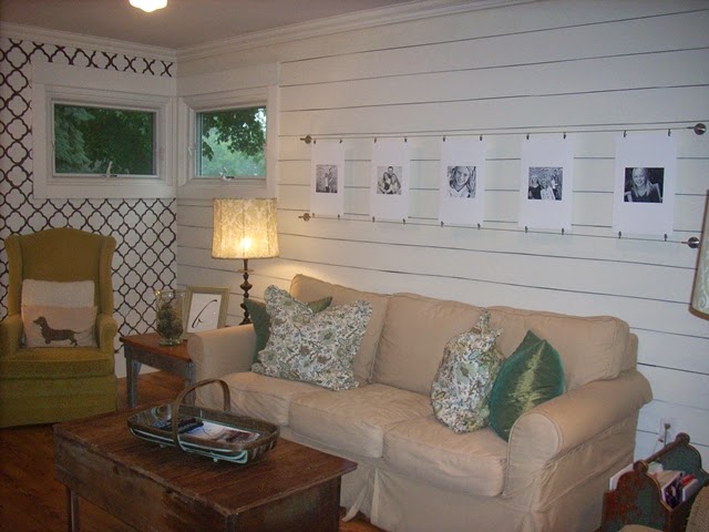
Oh my word! I'm horrified! There is so much going on in this room. Flea market wing backs, color, pattern, rustic, damask, etc!
This was circa 2009 in my living room. This back room has always been awkward. It was added onto our house in the 1950's to accommodate Grandma Dionise, (long time owners of this place). It was actually her bedroom and sitting room. That's why there are so many doors-one to her original closet, one to the main floor bath, one to the adjacent kitchen and we added the slider to the backyard when we moved in the winter of 2006.
It's been an impossible room to furnish for that reason and for the fact that it is extremely narrow and butts up next to the breakfast bar in the kitchen, which means no furniture can be staged on that length of wall.
The walls painted Ben Moore's Clifton Brown made for a nice cozy sitting spot in the winter, but come summer...I was suffocating in there!
After Ken said no to my request for wall of V-groove paneling, I decided to forge ahead and paint my own. I taped off 6 inch widths and dry brushed Annie Sloan's "Old White" chalkpaint over it the length of one wall. It didn't need to be perfect, thank goodness, 'cause i'm so not!
Here's the final product then: Circa 2012:
Here's the same room with small changes made. Lime green out...brown chair in. Please keep in mind NO new furniture has ever been purchased to furnish this room. I guess that may be part of the problem. I'm trying to put a square peg into a round hole. :)
Another shot of the same furniture rearranged. Still trying to stage this baby so I'm not disgusted.
Last year, I painted over the dark brown accent wall (left side of pic) and covered it with my kitchen wall color. (Cape Hatteras Sand)
A few months ago, while Kennedy was at school, the stenciled wall was the last to go:
This took four coats of stainblocking primer!
The room is much simpler. Much more subtle. Some (Kennedy) might even say "boring", but I'm calmer here. And that's always a good thing.
I'm not quite ready to paint over the faux wood planked wall yet. I like the way it makes the room lighter. In a perfect world, I would wrap the whole room with white painted wood, but this world isn't perfect and I can live with that. (sometimes)> :)
Taken on the south side of the room facing into the adjoining kitchen.
I would love to find an inexpensive clean lined taupe-ish/gray sectional. Or a lighter sofa and two matching club chairs, but there's a daughter's college fund that is desperately calling for our attention so my garage sale finds will have to suffice. (Everything in this room except for t.v., far lamp, small sofa-which was clearanced at Great Lakes long ago and I always intended to have slipcovered, and West Elm striped drapes-the rest are garage/estate sale finds that have been altered/painted or left as is-Even the rug was acquired through bartering)!
Built-in's would look so nice on that t.v. wall, but now I'm really gettin' the gimmies. Sometimes less is more. I'm happy the busy patterns are gone and that this space and the kitchen now feel a little more connected.
Room for Change: "Where a little change, goes a long way!"


Hi! I recently found your blog! Love your style and creative design! I'm curious how you printed the pictures that hang on the wire rail. If you're willing to share, I'd love to hear more. Thanks!
Post a Comment