I wanted to show you one of my new client's projects that is near completion. I met Sheri this fall when she was in the middle of an extensive interior remodel of the home in which she was raised. She and her husband had just purchased it this summer from another party but this is where she grew up-the home which her parents built back in the '70s.
I didn't get to see the home in it's original state but she called me in to help with paint colors throughout and then again, a couple of weeks ago, to offer suggestions for accessories.
Of course, I had to snap some pics of the little details I thought you Champs would appreciate. I wish I could take credit for them, but Sheri gets the credit for the bones. I'll take credit for colors and later for the wall art and details. :)
She selected black kitchen cabinets which totally work with all the natural light and the large size of the adjacent living room!
Still waiting on the hood vent and the backsplash tiles. We were wavering between a natural stone look or glass subway tiles in a light taupe.
Here's her granite. We thought pulling out the taupe color might be nice, but we don't want it to look too dark and rich. She wanted an urban vibe that was inviting but fresh looking throughout.
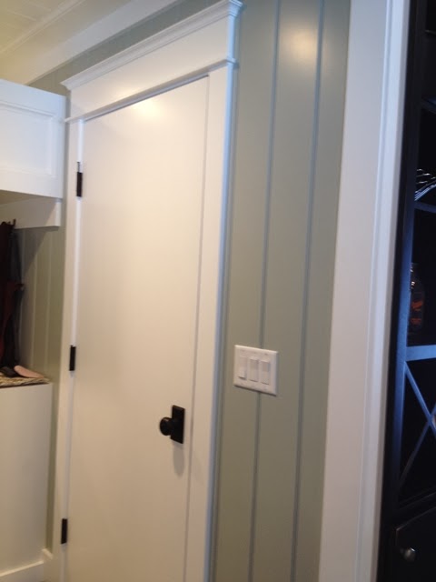
This is the mudroom door that opens into a large hallway and faces into the kitchen. I love the beadboard and color contrast from wall to trim.
Here's an original built in cubby in the hallway that was modified. We're working on wall art to the right of it, which leads to the actual front door and laundry/half bath.
I loved this pantry door that her husband modified to house a frosted glass panel. They bought, cut, primed and painted a full door from Menard's.
They ran the wainscot on the ceiling in the mudroom too. Love it!
We're adding rustic barn wood with hooks to the wall on the left for more hanging options.
Beautiful armoire style stainless fridge:
I had suggested these semi flush pendant lights with round drum shades. I think she found these at Lowe's. She was originally wanting a brushed nickel finish on everything but settled for a deep oil rubbed bronze which looks really nice too.
Here's her daughter's bath on the main floor. I love the espresso cabinets paired with a light taupe paint color and gorgeous quartz countertops.
A subtle linen looking tile was selected for the flooring to compliment the counters.
This is an extra room next to her daughter's room on the main floor across from her bath. They wanted a fun, 'bonus' type room where she could hang out with her teenage friends.
Sheri's husband surprised their daughter by painting one of the walls in that room with dry erase paint. You can actually use dry erase marker on it and wipe it down. It has a very glossy look to it so it's not meant for every room, but here it's fun and perfect for a teenager and her friends!
Here's the master bedroom. Serene and simple. Looking at different linen upholstered headboards to complete the look.
Master bath: which her husband wanted to look and feel very masculine. Mission accomplished. I love the tile they chose. Artwork will be hung above the toilet but other than that, the simplicity of the room speaks for itself.
Again, amazing quartz counter with undermount sink:
Still waiting on one more knob from Menard's. :)
The two boys have their bedrooms in the lower level. I didn't snap pics of those rooms because we were focusing on adding details to the main living room in the basement. Here is the sectional sofa that is down there which needs some layering with pillows.
On the back wall we are going to hang pictures horizontally and add a console table with lamps to the wall on the right in the pic.
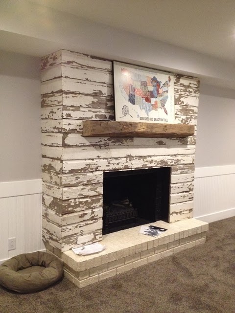
This was the attention grabber though in the room. I literally screamed out loud when I walked down the stairs and saw what they did to the original painted brick (okay, but drab) fireplace.They purchased some painted barn wood from a guy in Marne and wrapped the entire thing! So cool!!
Do you think I can I talk Ken into doing this to mine? :)
They added the barn beam mantle and we'll be adding wall art to the right.
We're still working on staging the rooms with accessories, art work and furnishings. I hope I'm asked back to help with finishing touches so I can show you the true "afters".


The house looks great!
Thanks Angela. The homeowners had great vision!
Post a Comment