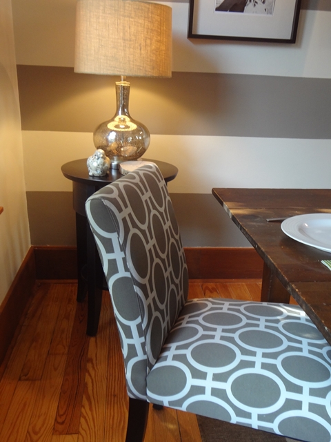
You know I've been struggling Chumps with the stained trim in my dining room. I love the historic charm of the dark stained trim but it's been pretty limiting in terms of wall color I can pair with it. I've always wanted to do a white on white room in my house but never had the guts. This is baby steps toward that look. I started out by freshing up the walls with an antique white. The same paint color actually that I had used in Kennedy's bedroom makeover. I liked how it looked with the trim in her room so thought it should be fine in the dining and "parlor" as well. My sister Laurie walked in last week after seeing it for the first time and exclaimed, "It feels like I just got my bangs cut and everything is brighter"! That is really how it feels. I think I'm okay with leaving the trim for a while, but after you see my office makeover that I will post next time, I might have you (and me) convinced that it's time to paint over the 100 year old pristine wood trim. (Sounds so sinful when I describe it that way). I'll keep you posted.
A couple of weeks ago I gave you a sneak peek at this dining room wall and the paint color that I fell in love with at Ace Hardware. It's a "Clark and Kensington" color called "Baby Elephant" and that's exactly the color it is. A cool taupe color that isn't gray and isn't tan but a great combination of both. I knew I didn't want to eliminate brown accents completely in my house but I have been weaving touches of gray throughout each room. (This totally dates me, but remember that awesome song, "Touch of Gray" in the 80's by The Grateful Dead?) Glory Days. I digress.
Back to the dining room...I painted the entire wall antique white to start and was mortified by all the imperfections on that wall. I realize now why the previous owner had wallpapered this room originally. Because of the office remodel on the other side of this wall, we were able to rewire electrical to to add sconce lights here (no ceiling lights anywhere in these rooms) but this only showcased all the flaws! Need to hide the problems....let's add stripes!
I marked off 12 inch stripes with a ruler and pencil and rolled "Baby Elephant" over the white.
Definitely made this room much edgier than it was before and I think I like it.
New Pottery Barn wall sconces. I turned them off in the photo to show the style of the light.
Ken's already smacked his head on the right one twice now getting up from the table. oopsies.
Ken's already smacked his head on the right one twice now getting up from the table. oopsies.
I didn't put drapes back up on the large windows so the neighbors have a front row seat at dinnertime but my life's an open book...what do I care?
My neice is scheduled to take new family pictures of us this week so these frames will be updated as well! Of course I'm coordinating our outfits to match "Baby Elephant"! :)
Fabric that I actually bought last year at Fields. I dug that out and recovered the seats of these free hand-me-down dining chairs I got a couple of months ago from my neighbor. (I painted the chairs a buff color and didn't want to repaint them, so I was glad this fabric had a light tan that pulled that together).
I fell in love with these from Target (online). The taupe matches perfectly. They are not as tall and stately looking as I would've liked and they're off limits for spaghetti night, but otherwise, I'm happy with them. Good looks and good price. "Crusty" likes that combination.
I won't ever be ready to replace the dining table Ken built for me when we lived in our last farmstyle house. I like the size and look too much to change it out. I don't love how it looks with the stained trim though...another valid reason to paint the trim perhaps?
Just for fun, here are a few shots of what the room was prior to "Room For Change" making changes. :)
Waaaayyyyy back in the day. Circa 1960's? Notice, there was electrical once upon a time. I know you're in that ceiling...come out, come out wherever you are. Pleeeassse. I want a dining room light!
1980's perhaps?
This pic. below is what this room has been for the past 5 years...I liked it. Easy to live with.. transitional farmstyle look but ready for a change.
Here it is now:
I used to have a slender buffet underneath the pictures but when you sat at the table, it was a bit pinched. If I find the right piece, I may add one later but for now I like that it feels a little larger in here.
Again, here's a pic. I scanned from the family that lived here in the 50's, 60's and 70's. So it's always been an awkward room to furnish. This room we call the 'palor' is adjacent to the dining area.
A couple of years after we moved in. Remember the dark brown fireplace? I loved it for a while, but it made the room so much smaller and darker.
The wall color was a Restoration Hardware color called "Latte".
As of two weeks ago:

As of a couple of days ago. New rug.
World Market Gray Jute rug.
Next up? Office remodel. Stay tuned.
Enjoy your weekend Chumps!


Where did you get the chandelier that is over the dining table?
I found that at "Art in the Park" a few years ago.
Post a Comment