 . I've often said my favorite thing about this job is meeting amazing people and this project was no exception. This is the second time I've decorated this house. The first time around was a parade home in 2008. This client liked the floor plan and built virtually the same house, so I knew it like the back of my hand. I always looked forward to my appointments with Lindsey and we were 'on the same page' with just about everything that went into this house. She was willing and ready to take risks and I had so much fun trying to pretend that I was as stylish and trendy as she is!
 This wallpaper in the half bath was the inspiration for all the colors in the house. She had found a picture of a swatch of it in a magazine and we thought it was a rug...so we planned her whole sunporch around it. When we discovered it was actually wallcovering, we ordered it for the bath and ran with the same retro theme and color scheme throughout the rest of the house.
 We luckily found a rug for the sunroom that we liked as much as the original idea. Found this at Pottery Barn.

I thought the antique dolly cart would be a great addition to the room and she found a guy in Allegan that refinishes them beautifully!
The original parade home that I did was much more rustic in nature and we incorporated some of that with the wood tones in this house as well.
 We both fell in love with the 'lines' of this funky furniture. Notice how high the backs of the pieces are. I think they fill the great room nicely. We pulled in more greens and browns in this area to lighten things up. I used a lot of Benjamin Moore's new Aura Paint colors in this house.
 Our very favorite room in the house is the nursery which is now being repurposed into the office. We found a black/cream wallpaper that we had to have and had it hung above 'library panaling' that offsets it nicely.
 Ugghhhhh! I am a horrible photographer. I will get a better shot of this room when we have it finished as a new office so you can see the contrast of all the black and white.
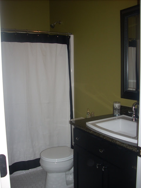
 Here's the half bath right next door to the black and white room.
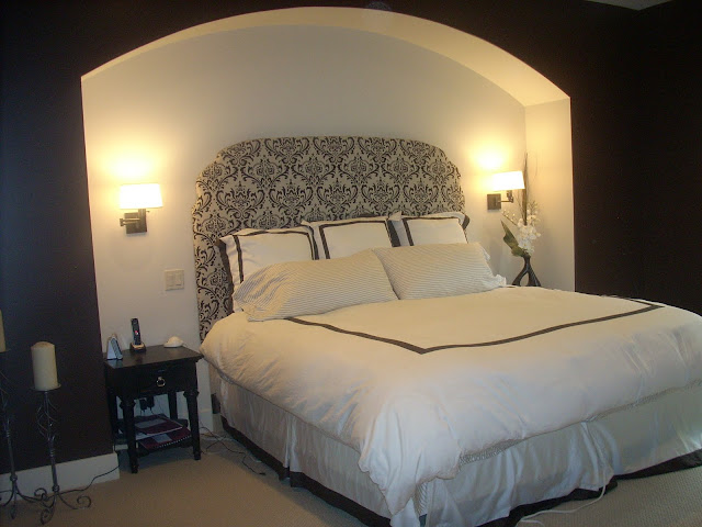
Initially we had trouble finding master bedroom bedding that wasn't cheap looking. We both knew we wanted it to feel like an elegant hotel room. Crisp and clean, but not overly formal. Ken and I made the headboard out of plywood, batting and fabric that Lindsey had found. We recessed the bed into the wall, (a change from the original floor plan) and added sconce lights. Hard to see the color, but it's a deep chocolate brown.
The walls in the master bath were covered in a light tan/grey linen looking wallpaper. Classic and simple.
The front entry needed something sturdy and stately looking. Lindsey has a friend that owns a glass place and we had a mirror custom made. Soooo huge and so great. My girls would be dressing up in front of this all day long. She was two girls as well. They'll love this in a few years!
 The basement includes a kitchenette, billiard area, half bath, full bath, playroom and three bedrooms, plus some fantastic storage areas. Very fun, casual space to hang out with friends. It feels a little more contemporary down here with black cabinets, slate blue walls and furniture that's a little more modern.
Both girls have bedrooms in the lower level. One we finished with the completion of the house, the other we're working on now. I'll post pictures of the completed room. We're doing some fun things with polka dots for that one. This is Sabrina's room and Lindsey's masterpiece. I gave her instructions, and she ran with it.
Beautiful Sabrina modeling the room her talented mom painted!
We knew we wanted something dramatic for the half wall above the board and batten look. We thought we'd do a headboard, but didn't need to after all! The dresser I found at a garage sale and painted it hot pink with a dark stain over it. I think Lindsey probably spent more on the glass knobs then for the entire dresser, but it completes the girly look.
The girls' bath matches Sabrina's room and we'll make sure the colors of Annabel's room match the pink/green theme as well.
We chose this wallpaper because we loved the large print and the colors were so great. She wanted something fun and different for the guest bath in the lower level.
I wanted to show you the cool slate floor that we used. Lindsey's husband, Brad poured the concrete countertops himself. I should've gotten a better pic. of that. I thought they turned out great.
This is the wall in the laundry room. It looks like it could be wallpaper, but it's actually real stone tile. We wrapped both walls with it, and Lindsey said she loves being in this room...not doing laundry, but enjoying the colors/decor.
 This wall is adacent to the laundry room in the back entry. I wish every project was as fun and rewarding as this one was. Not only did a get to meet an incredible new client and friend in Lindsey, I've had the opportunity to work with her mom and sister as well. It really is all about the people. Thanks Lindsey for sharing the better part of a year with me. Lots of Mountain Dew and Diet Coke later, and I'm proud of what we accomplished together and the friendship that was forged. I think you rock!


Awe :) you know I loved working with you too! Kinda fun seeing the house this way with someone elses eyes :) thanks for really making our house a home! :) you sure were a lifesaver more than once!
Lind
Post a Comment