On Sunday after church, I was responding to an acquaintance asking where Kennedy is looking to attend college (possibly Azusa Pacific in California) to which this acquaintance replied. "Wow, I'm impressed you seem so composed about that".
To which my second reply was: Check back with me in August." :)
This pic was taken after Kennedy returned from Azusa last week. I think sissy missed her as much as I did.
That being said, I'm bummed to report that Ken and I won't be peddling our "Room For Change" wares at the downtown Zeeland Spring Peddler's Market. We love that show and we have so much fun doing it but my time will be spent this spring tidying things up around this hundred year old bungalow to host her graduation open house.
I am still managing to find time doing what I love...filling custom orders, and meeting with you Champs for design consults. Here are a few that went out yesterday.


A shortened version of The Shema:
This morning, I got to revisit a client's house (Weaver's) that was purchased two years ago at which time I was called in to offer a bit of direction for color choices and to help with vision for the project. I stopped by once or twice in that time frame to offer suggestions as they made their way remodeling this sprawling bi-level.
I have to admit, on the first initial consult, while I could share their enthusiasm for the amount of potential this place held, I was a little overwhelmed for them. It had great structure and bones, but was dark and had lots of oak throughout.
New LVT wood looking flooring, new backsplash, cabinets, hardware, stools, and some appliances. You can see in the before pic, that the stove even shifted.
This was a desk area that Kylie didn't think they would use for a desk and she was concerned that it would become a gathering ground for junk.
So, it was reconfigured to be a coffee bar with plenty of closed storage and new butcher block to compliment the granite.
I didn't get an after pic from this angle, but suffice it to say, this kitchen has been given a new lease on life!

BEFORE: Kylie and I were really torn about leaving the fireplace as is. I loved the rustic quality of it and didn't want her to slap paint on it or replace it right away. I'm glad we were patient as it still does give the family room character. She told me today they haven't ruled out updating with a different kind of stone or brick down the road, but for now, with all her pretty things around it, it works! BEFORE:
AFTER: Not much has changed other than the wall mounted t.v. which was a great solution for facing the furniture towards the focal point of the room (t.v. and fireplace).
This wall below was another debate. She and I were struggling with whether to take out the builts in and open up part of the wall into the kitchen. Her husband was a fan of taking it down-we were worried about having enough room to stage furniture.
The wall and shelves came down and it was beyond the right decision!!!
BEFORE:
AFTER:
BEFORE:
AFTER: The natural light that comes in this room from the dining room is amazing and both the dining and the family room feel so much bigger now!
Here is the same wall and space after:
AFTER pic taken from opposite fireplace corner:
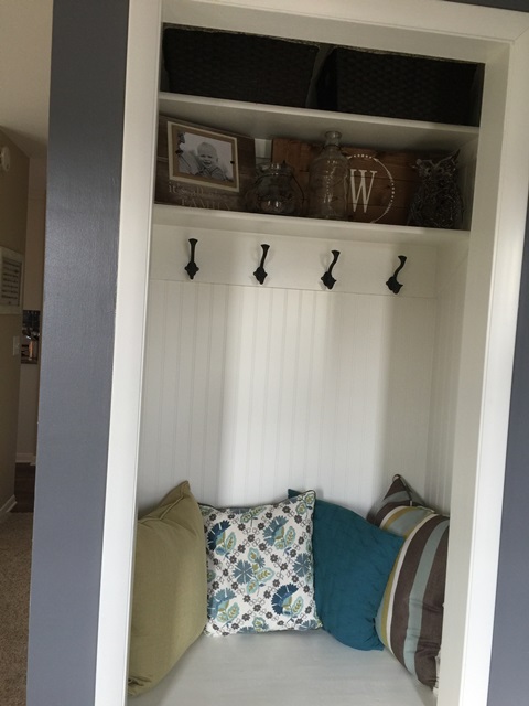
New carpet. colors, painted trim. stairwell newel post, and entry closet repurposed into a bench area.
This is across from the front door in the pic above. Great use of space!!
New lockers in the back hallway/entry from garage.
Cute half bath off of back entry hall.
Here is the IKEA shower curtain system in place displaying her little ones' artwork in the lower level hallway:
This girl has a knack for accessorizing. I kept asking her "What am I doing here"? :)
Comments...


