Monday, August 26, 2013

Must Be Present To Win

New sign I have hanging in my kitchen. I stenciled it as a reminder to not let so many moments go by unnoticed.
 I confess, I've been doing that a lot lately.
 Not being fully present. 
Preoccupied. 
Distracted. 
Annoyed almost.
I know what I gotta do. I just gotta do it.
Breathe in and out. 
What a concept.
My nervous eye tic that shows up every fall is making an unwelcome appearance already.  That too is my physical reminder that I've got too much on my proverbial plate and to step back and reflect on the carefree summer moments that could (and should) linger into fall here in west Michigan. 
A few more sunsets need to be enjoyed. At least another handful of Paddle board rides, and plenty of bike riding will be my excuse to ease into fall and guard my schedule from becoming unbearable.

I love the change of seasons around here. I can't wait for football games, tailgating and backyard campfires, but I am also sad to say good-bye to summer traditions, like camping, garage sales, beach and pool days and our monthly tradition of shopping at Allegan's Antique Fair. We'll hit it for one more time next month, but Sunday was probably the nicest day-weather wise that we've ever experienced. Just perfect!

Of course I had to take lots of pics of the booth display of my 'designer crush' once again. I promised her I'm not a creeper or stalker, but her vignettes are truly artistic in my book.You can find her on FB at "Diane Passi"-Floral Design and Antiques.
ppassi@aol.com
Can you just picture having a barn themed/rustic wedding if she were to stage it?


 {Playing around with the filter on my "Photoscape". Below- So fun!}


 Seriously....this is ART!


With the sun shining down, a cool breeze blowing and the smell of elephant ears, there weren't many booths that day that didn't seem to be calling my name.


I snapped a picture of this dresser there that day because I just saw it posted somewhere (can't remember where) for winning a DIY contest through some newspaper or magazine. Maybe it was a knock off of the one that won, but I loved this idea. Using an overhead projector to transfer an image and then to fill in the design with free hand painting.
Isn't that sweet?

 With all the gawking and envying I did that, I still managed to get some vintage bargains to resell in my booth.  We also hit a few Allegan garage sales that morning to add some more fun finds to my stash.


 Some of the items need some TLC and are sitting in my garage waiting for some attention, but others, I already brought to Not So Shabby and are patiently waiting to make your acquaintance.
Hudsonville Creamery Wire Basket-$35 (Sells in the Pottery Barn magazine for $99).
I have two.


I also dropped of 6 more planked style signs.  Get 'em while they're hot. I can't keep 'em in stock. They make great housewarming or b-day gifts. 

 More faux metal letters


I couldn't part with this baby. Bought if from a vendor at Allegan who said she had it proudly displayed in her house for quite a while. Now it's in my kitchen making me smile-helping to explain to my teenage girls who haze me for my wrinkles and sags, the reasons why I look a little 'worn' .  :)


Comments...

Monday, August 19, 2013

Trendy Lynda's Remodel


 A couple of months ago, I posted some "in process" pictures of my super fun and trendy friend/client Lynda's main floor remodel.  I wanted to show you the almost completed look now that majority of the project is behind us.  There's little finishing touches to be addressed here and there, but overall, she and I were pleased that things came together as we both pictured them in our minds. 

I so wish I had remembered to take the true "befores" of these spaces.  The living room below didn't change size or shape but the kitchen/dining, back entry and laundry surely did.
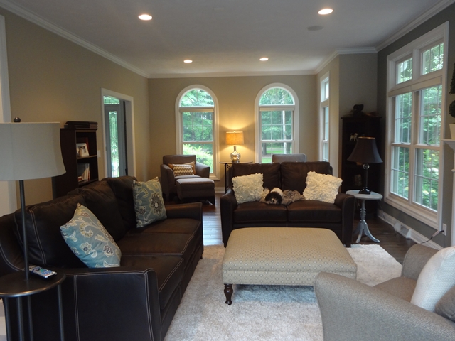
In this room, which was previously an earthy buff color, we concentrated on brightening the space up and giving it more of an 'urban' look-clean lined furniture, cool taupe color scheme, spare and almost sparse with regards to accessorizing.

 (Still needing to hang some artwork which we selected, and wanting to flip out the black lamp on the right for a more modern look).


 We staged the room into two separate areas. One for lounging/t.v. watching and the other toward the front of the house as a reading area with two comfortable Charcoal Grey Rowe chairs. The handscraped hardwood flooring is new and so is all the furniture. Round mirrored table is from Ballard Designs.

 Here's the view from the open kitchen into the lounging area of the living room. We transtitioned wall color at that corner for a better contrast leading into the master bedroom addition that we finished a couple of years ago. The sofas are from Talsma as well. We loved the light, contrasting stitching.

  Behind this chair is the entry to the master bedroom suite. Lynda liked the lines of this chair and didn't want to part with it so we had it reupholstered in some new durable decorator fabric from Talsma's.

This angle below is the opposite corner of the room as you face the front of the house.
 Below is the view from living room into the newly expanded and  remodeled kitchen.
 We loved this Rowe fabric and had it reupholsted on an ottoman that she ordered online.
 Drapes from West Elm give the end of the space some flair.


 Picture shot from the reading chairs looking into the foyer.  She wanted to keep her buffet and entry way vignette.  She only needed to switch out the inset granite pieces on the top of that piece from green to black.

 From the entry looking into the dining area that used to be a front office. Table and Chairs from Talsma.  Drum Shade Pendant light online.
 The corner hutches were custom built to flank the ends of each wall and stained dark walnut to give the room some depth.  They will house her dining platters, glasses and dishware.
 We added the white wainscot to give the room character and so we could get away with a richer, deeper wall color on top.
 Lynda had this leaded glass custom transom window designed to mimic the side lites on her front door.
 A shot of her new beautiful and functional kitchen with a sprawling 10 foot island!
 We were originally thinking Cambria countertops for the island, but there would've been a seam with an island of this size, so we hand picked this granite slab from a showroom in Grand Rapids.It has an iridescence to it that we loved.  Stools are from Ballard Designs online.
 Wine Bar
 Custom Built Desk Area.  We used the same granite slab as the island but had the base cabinetry painted a taupe color to set it apart from the kitchen area.
 We HAD to have the commercial grade faucet and apron front sink! Lynda wanted to do away with the cornice above the sink area but I insisted that it stay. :)
  Did I mention that not only is this kitchen beautiful, but it's extremely functional as well? Lynda specified that she did NOT want a lazy Susan (or a "Lazy Christy" as we dubbed it at my house).  She had this designed to accommodate all her larger appliances. Brilliant! (and her crock pot is even adorable...where does the madness end)!?

 You can see the transition of color from creamy white cabinets with grey glaze to the dark walnut stained island.
 A shot taken from the mudroom/back entry into the kitchen.

 View from kitchen into the dining.
 Back entry off garage.  This used to be a half bath.  Now it houses lockers with enough room to contain the 'junk' of their four precious teenage kids.
 This room transitions into the laundry area (below).
We chose soft white shaker style cabinetry (custom built cabinetry throughout-(props to Lynda's amazingly talented Uncle Gene). 
We selected a linen looking laminate countertop that repeated the pattern in the tile floors.
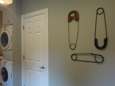
 Safety pins- another Ballard Design find. Walls are a soft sage/grey green.

Lynda first found the large laundry baskets and had Uncle Gene build the shelving accordingly.

I think the whole family-even the four footed ones, are enjoying their new layout and furnishings. 
Thanks Lynda, for once again proving to me that my 'job' isn't really a job at all. You made it way too fun. 
What's up next? The bonus room? Call me, girlfriend. :)


Comments...