Sunday, January 30, 2011
Garage Time
I finally found some time to work in the garage this weekend. I've been so busy with clients' remodeling projects, that I haven't had any time for painting. So, after sweeping out the slush and cranking up the propane heater, I finished some things that had been shelved for over a month. This chair was part of a set that a client dropped off for me to paint creamy white. She is going to have this chair reupholstered and the matching rocking chair fabric left as is. I didn't snap a picture of the the rocker before it was painted, but here's the 'after'...
Isn't the original fabric great?
You can see in the picture, the other chair with the ripped fabric is in the background...but here's the after of that one too....
Here's a couple shots of an antique nightstand that my Father-n-law found for me. I was anxious to get some black paint on this one and see the transformation. If you look closely at this picture, you can see that the top of it was badly warped. Some of the drawers needed straightening as well. That's a job that's beyond my wood working skills, so Ken to the rescue again...
The hardware appears to be brass, but it's really a worn antique bronze. I'm tempted to keep this piece to use as a nightstand for my bedroom makeover that is in process. More to come on that.
These little tables were mysteriously left in my garage about a month ago. I LOVE getting surprises from the 'Furniture Fairy". This time it turned out to be my 'Feighbors, ("Friends/Neighbors...I know..I know... really cheesy, but that's really what we call each other..."Fabes)"! Anyway, they were cleaning out their cabin, and left me with these treasures. I pictured this one in black as well. I'm finding that if I intend to sell these pieces in my booth at the store, I am better off painting them neutral, (white or black). The vibrant, off-beat colors sure are fun and trendy, but have a limited buying audience. So, Benjamin Moore black wood/metal enamel is MVP again.
(I spy Ken's leg in the background...he'd kill me if he discovered I got a shot of his 90's "painter's paints jeans"-his workshop uniform! Hee hee.) There's no sense of fashion around here on a Saturday afternoons!
I think this one will make such a cute little phone stand. Both these tables are heading to "Not So Shabby" this week.
I bought this chair at an estate sale in Allegan about a month ago. I liked it because it was really sturdy and I thought the scrolled edges would be cute paired with a desk in a little girl's room.
I'm tempted to stencil the back of it with a matching flower, but I don't want to limit the buyer to always having that fabric design on it. Changing out the fabric is such an easy way to personalize this kind of chair and it can be done to match any room decor.
Ohhh, I'm gonna stencil it anyway. It needs something more, don't ya think?
This custom sign was ordered by a friend of mine who just became a Grandma! Congrats Michele!
I used the same stencil on a rustic board to give as a baby gift to another friend who's expecting and due this week. (Oh, Mandy I hope you're not reading this-you haven't opened it yet). :)
And...that's my weekend in review. I can't wait to show you pictures of my bedroom remodel, but I am waiting on carpet. Should be sometime in the next week. Stay tuned....
Saturday, January 22, 2011
D.C. and Me
This is a project that has been near and dear to my heart. One of my closest friends recently moved into a "new to her" house 17 houses down from her 'old' house in the same neighborhood. I owe our friendship to my business. Debbi hired me to help her finish the basement in her last house about 7 years ago and it was as if we had been friends our whole lives. Our friendship has survived three remodels, two moves, and lots of drama! She has helped me navigate through lots of personal change as well. So fortunate to call her friend.
She's not a bad client either. :) We've been having fun working on small (and not so small changes) in each room to update it and make it feel more like 'her'. Here's a shot of the kitchen before...
Here's the after shot...
Before she even bought the house, she had me do a 'walk through' so we could assess how to leave the beautiful custom oak in some places, and downplay it in other areas. Since the kitchen sits in the middle of the house and sets the tone for what you might expect in other rooms, we decided to have the oak cabinets professionally painted and glazed, (thanks Doyle)! The granite and formica countertops on the perimeter were left, as well as the tile backsplash.
Here's another angle....
And some more...
The kitchen dining areas was painted a deep red and originally looked nice against the oak, but we wanted something a little more rich and earthy so we chose a dark greenish/grey/brown color for kitchen and dining walls.
We wanted to minimize the intensity of the oak trim in here so we hung soft, silky fabric panals over the window trim between each window in the dining area.
You can't see it very clearly in the top picture, but if you look closely, you can also see that we had the original oak flooring sanded down, distressed and darkened. It really made the creamy white cabinetry pop and made all the rooms appear richer and a little more casual.
Above, you can see the darker stain color in the entry. (Bear Creek Floors..thanks for putting up with two fussy females, Kendall DeLange)!
Here's a before shot of the living room. We liked the color so much that we just freshened it up with a new coat of paint.
We both loved how the kitchen cabinets turned out, that we couldn't stand to leave the entertainment center alone. Another call to Doyle, the painter, and he worked his magic on the living room wall and mantle.Below is a before shot of this wall. The new paint and black mantle transformed that fireplace. The slate tile was barely noticable before and now it's the focal point of the whole room!
Doyle used a darker cream paint for the basecoat and heavily glazed it to give it a different look than the kitchen. We are now having the basement kitchen cabinets done in just a creamy white without a glaze. More pics on that project to come.
Here's the front office before...
Here it is with a coat of chocolate brown paint and new hardware:
And some miscellaneous shots of other rooms that have been updated:
The mudroom which was orginally a hair salon...
Stay tuned for the rest of this 'home tour' once we've worked our way from room to room...bathrooms, bedrooms and basement next.....
Comments...
Sunday, January 16, 2011
Wedding Shower
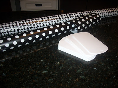
Last Saturday, my sisters, Mom and I were invited to a wedding shower/brunch for a family friend. My Mom asked me if I was willing to put together a little something for the table centerpiece. The shower was to be held at a local restaurant, (Salt & Pepper-fabulous!) so we didn't need to do much. The decor, atmosphere and food there is already yummy so I would only need a few small things to make it feel more festive. My inspiration came from a photo online that I stumbled across in which the hostess used wrapping paper as the table runner. I had a stock of black and white, but really wanted something a little brighter and more whimsical. I also had these white pillow box favor boxes that I bought last year at Target. They came in a package of 50 marked down to $3.00. I've made these boxes before too with a pattern I found in a book and you can personalize them with stamps, stickers, paint, or in this case, wrapping paper.
I found some teal/white wrapping paper at Don's downtown Zeeland and some matching ribbon at Big Lots, (which was in the Christmas clearance for 75% off). I also had lots of glass jars on display around my house that I had filled with all kinds of faux green fruit...mini apples, pears, etc. I thought that putting them together as a collection might look nice with the bright blue paper.
I wanted to fill most of the favor box with some kind of filling so I didn't have to spend as much on candy. (I know...I know...I'm way too cheap). I thought of raffia, but didn't have any budget for this project, so I turned to another favorite crafting tool....
My $8.00 paper shredder that I found while garage sale-ing in Saugatuck this past summer. I had wanted a paper shredder, but didn't know if I would use it enough to warrant buying a new one, so imagine my surprise and delight to find an almost-new one for $8.00!
With the paper shredder, I used an old piano book of love songs that I also bought at a garage sale. I like really old and yellowed pages, but they don't slide as well through the shredder, so opted for this book. I used the strips of music to stuff the pillow boxes and then filled them with chocolate hearts from The Dollar General- (another great addition to our fair city that I couldn't live without now).
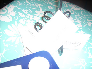
 Oh, so sorry this picture is so bright. I took a picture of the nametags that I made using a circle cutter but the flash reflected off the wapping paper. The circle was adhered with a glue stick to the plain white labels and names were written to the right of the circles. Just another way to tie in a little more of the wrapping paper's color and design.
This is a new font that I fun printing out and cutting a stencil for. I used it on the side table and printed another one to be put in a frame and displayed with the glass jars as centerpieces.
I had just bought this vertical frame when we went to Shipshewaunee last month. I had bought a horizontal one the year before and have used it on so many different applications, not just to hold pictures, but to print out different sayings. Here, I used a vintage flashcard to use for the middle of the table as well.
A close-up pic of the pillowbox against white table settings.
And, true to my nature...running 100 miles an hour in the wrong direction...I forgot my camera that day to take pictures of how it all came together. So, I recreated the display on my own table at home. It looked much nicer with the S&P decor and set up, but you can get the idea.
Or course, white cloth napkins, pretty flatware, lots more ribbon tied around wine glass stems, and some presents wrapped in the same paper and you could use really dress it up even more! Think baby showers, high school graduation (with different color candies in the glass jar) and even wedding banquet tables.
Pick your favorite color scheme and run with it! Hope your 2011 is off to a great start!


